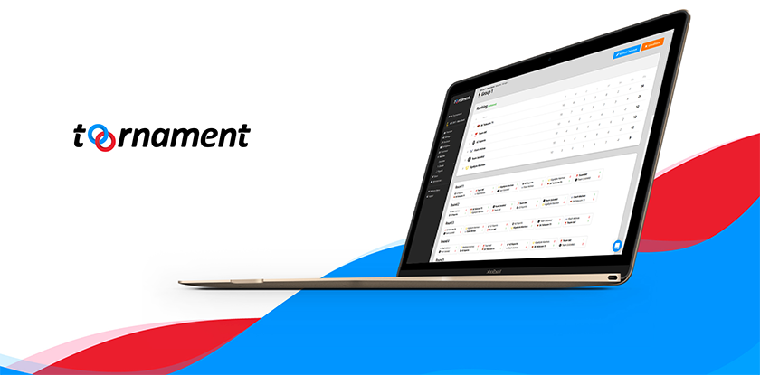
We are proud and excited to reveal our new brand logo!

This new logo was the logical step with all the recent changes brought to the platform since the Version 2 was released a few months back. A new system structure, a new participant interface, new API features soon, it all called for a design evolution to mark the occasion.
Plus, the idea was to have the logo circles be self-sufficient, recognizable outside the website, even without the rest of the name.
Improvements to the logo came in two main ways: proportions and width (plus color depth). The new logo is more balanced, and has an improved depiction when in small size, besides other logos or placed above vibrant colors.
For all of you users of our API, here are the new “Powered By” images that you can use on your pages:

White Version
